Amplify Austin
Amplify Austin
Case Study:
Amplify Austin
I had the amazing opportunity to design for ACC’s Student Services with a team of designers.
Goal
The goal of this project was to design promotional material for ACC’s Amplify Austin campaign. This campaign will raise funds for ACC’s emergency student fund, providing students with aid and necessary help.
Inspired by such an amazing cause, my team and I began to work on our process.
Creative Brief
Our first step to finding our design solution was a creative brief. why is this important? The creative brief is the blueprint for our design. It gives us the What, Why, When, and Who.
What are we doing?
Why are we doing it?
Who are we doing it for?
When do we need it done?
The client helped answer these questions in our creative brief which helped us immensely. With context and intentions, we could begin our design process. However, before moving into visual design, we got this creative brief polished and thorough. Having these details would help ensure our design didn’t miss the mark.
Mood Boards
Creating a mood board helped us set the tone for our design. We made this mood board using our creative brief as a reference.
Sketches
My team talked it over and we decided that with what we got from the creative brief, this design should reflect the cause which is positive, energetic, and inspiring.
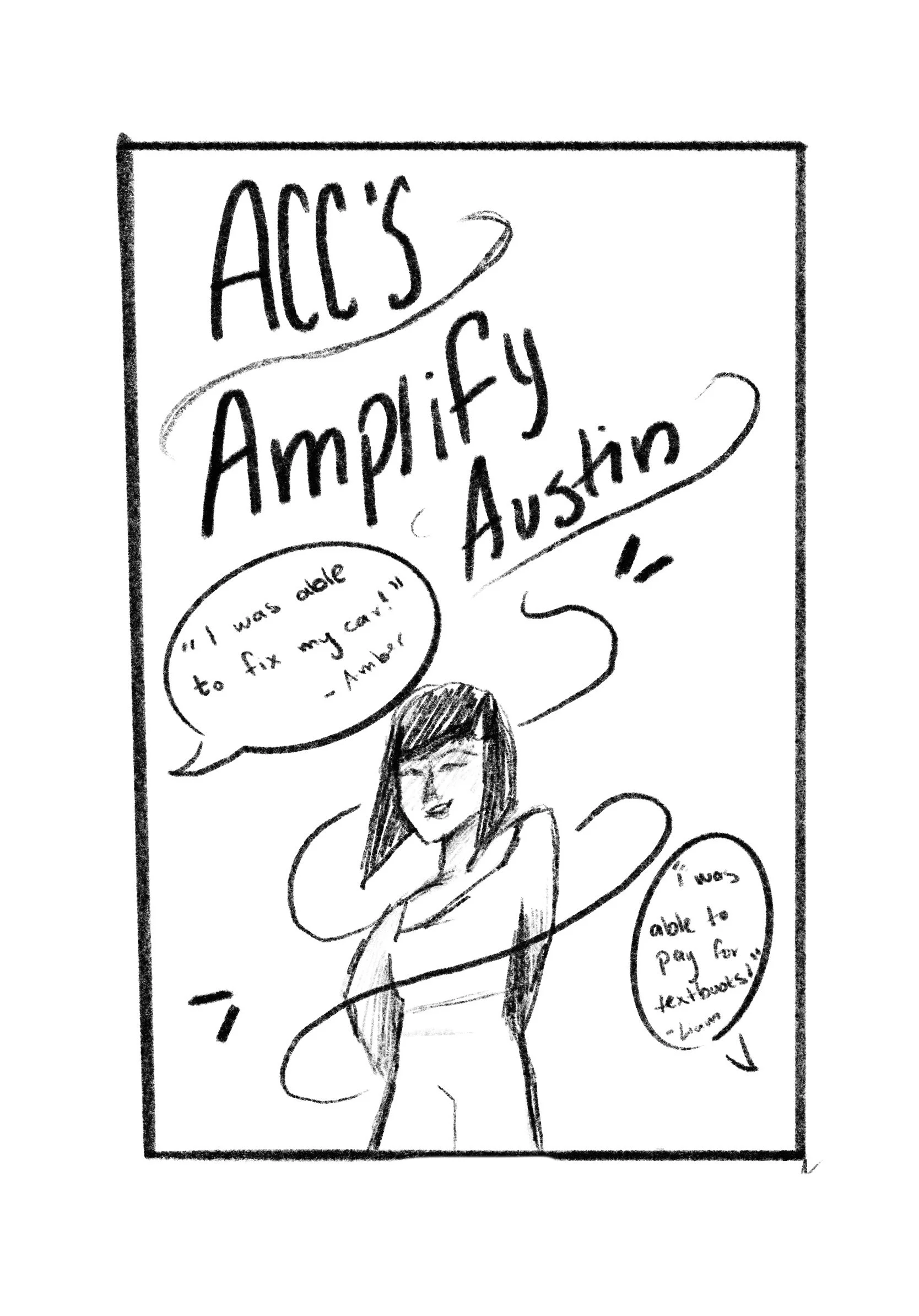
Now that we had an idea and tone established, it was time for sketches. All of my teammates made sketches individually. After presenting our sketches and discussing our objectives, we chose one sketch to move forward with. I was very excited and honored to have one of my sketches chosen.
First Sketches
Chosen Sketch
Why this sketch?
As a team, we decided this sketch would be a good base for our poster design because it had some playful elements as well as quotes which makes it feel inspiring. Having the student would also help bring some human connection to the poster.
Digital Drafts
My team and I worked on making a digital draft of the chosen sketch.
At this point, my team was also split into sub-groups. Some of us would work on the poster, some on web assets, and others on social media tiles. our goal was to work together to create a consistent look throughout this campaign.
Since my base design was used for the poster, I stayed on the poster team and worked with my team to evolve the design to it’s highest potential.
Roles and Responsibilities
This project involved a lot of designers. Having so many creative minds together was great, but to make it work, we had to create a structure. Having roles and responsibilities assured we would stay on task, and meet deadlines.
Our roles would often change, and we changed according to what felt best. While everyone designed, some of us would take the role of brand manager, designer, and other roles.
The poster design was the base for the web assets and social media tiles. Since I worked heavily on the poster design and it was my initial design, I worked to help my team with consistency and overseeing that all assets worked together.
Draft 1
This draft contained inspiring testimonials, a picture of a student, fun shapes, a QR Code, and bright colors.
Draft 2
In this draft, we spread the shapes throughout the poster, made the shape behind the student smoother, and added a headline.
Draft 3
For this draft, we formatted the information more simply and made the headline in the speech bubble. We also changed the font to Gotham ACC’s official font and made all colors official ACC colors.
Final Poster
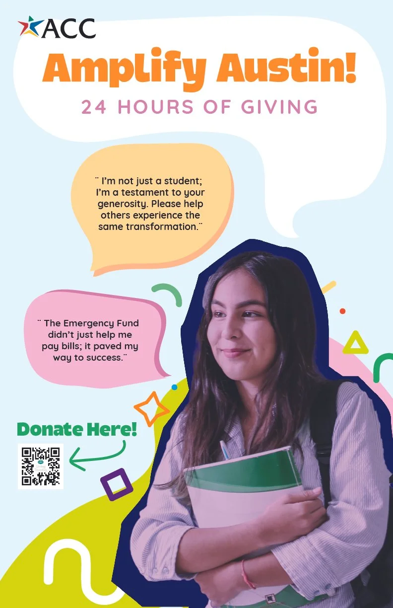
The final poster we created was a culmination not just of what our client wanted, but what this campaign represents: positivity.
We kept a playful look by using bright colors, and fun shapes. These are all in official ACC colors to stay within brand guidelines. In addition, we used shapes and overall layout to aid visual flow and give viewers places to look.
The information is laid out in a way that is simple to read, which is important when you have body copy that is meant to be read and processed. In this case, it’s even more important that we keep the viewer engaged and make it clear what our call to action is (donations!)
For the picture, we decided to use a photo of an ACC student provided by ACC’s marketing team. The student’s smile radiates positivity, and her position works well with the speech bubbles. Having the subject be an actual ACC student works great because that’s exactly who this cause is going to help.
Takeaway
This project was a great experience. My biggest accomplishment leaving this was being able to design something that would make a change. These donations will mean a lot to students who need it. These students are also our future; working members of society that will make change. That is something we wanted to emphasize during this campaign.
Getting to work with other designers was also an amazing accomplishment, and I not only got to experience different team roles but also amazing teamwork and support.
I’m honored that my design was chosen and used for this campaign, and I’m extremely proud of my team for the hard work that went into designing this.
Previous Project:


