Firefox Streaming Service
Firefox Streaming Service
Web Design:
Firefox Streaming Service
For this project, I designed a streaming service while keeping true to a brand’s style guidelines.
The Challenge
Creating a brand identity is always fun. New ideas are great, but what if a brand already has a style?
My goal was to design a streaming service for an existing brand, I chose Firefox. Firefox has an established style guide, with specific colors, typography, and illustration styles. I had to abide by those style guidelines to create a design people could associate with the brand.
Sketches and Ideation
Before I started with sketches I went through the research phase. The main focus was user needs. What would an average streaming service consumer want, expect, and need?
After researching big streaming services like Netflix, Hulu, Paramount, etc. I got a feel of what the basic needs were: A profile selection page, a home page, and a page for each individual pick. Within those, there are a lot of small things that I could be incorporating such as lists, suggestions and targeted picks.
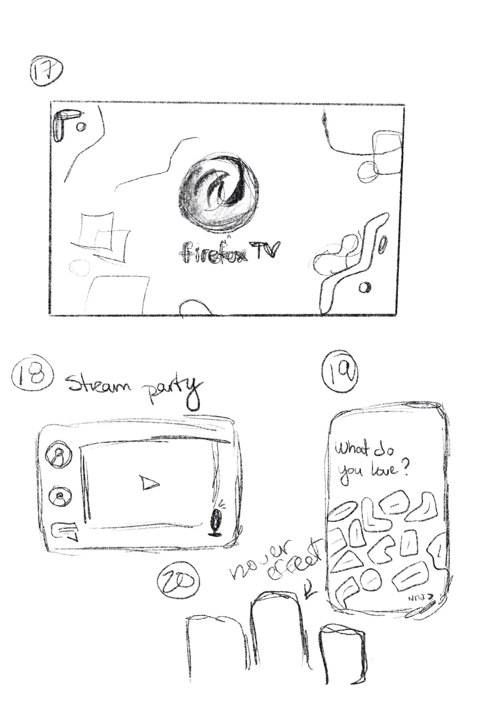
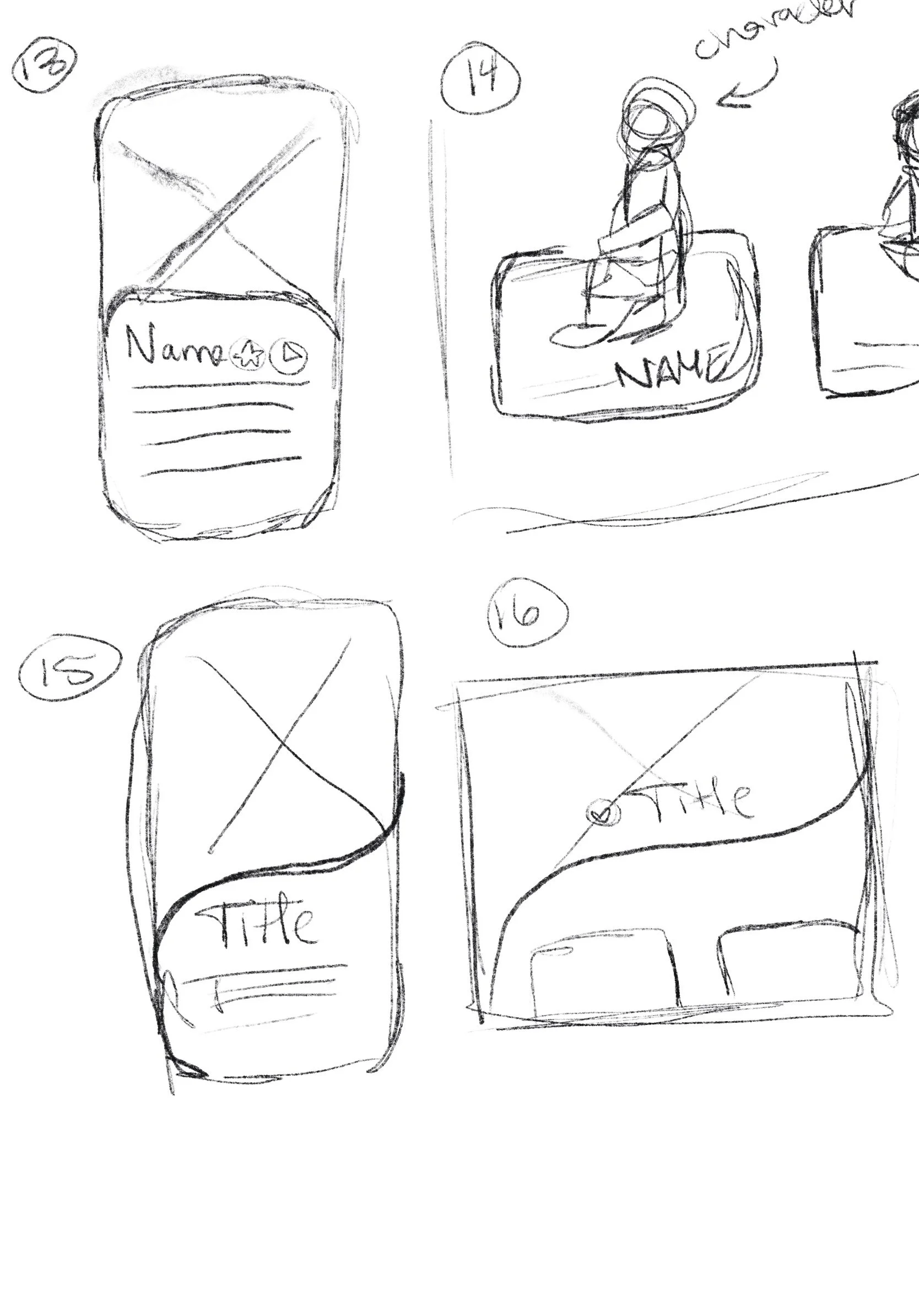
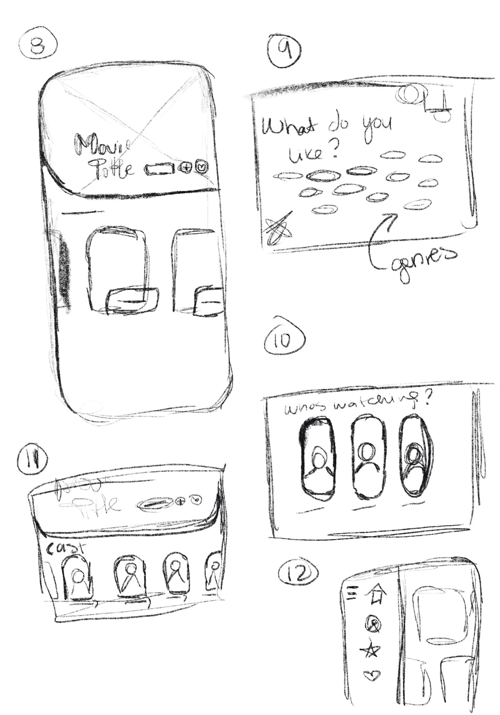
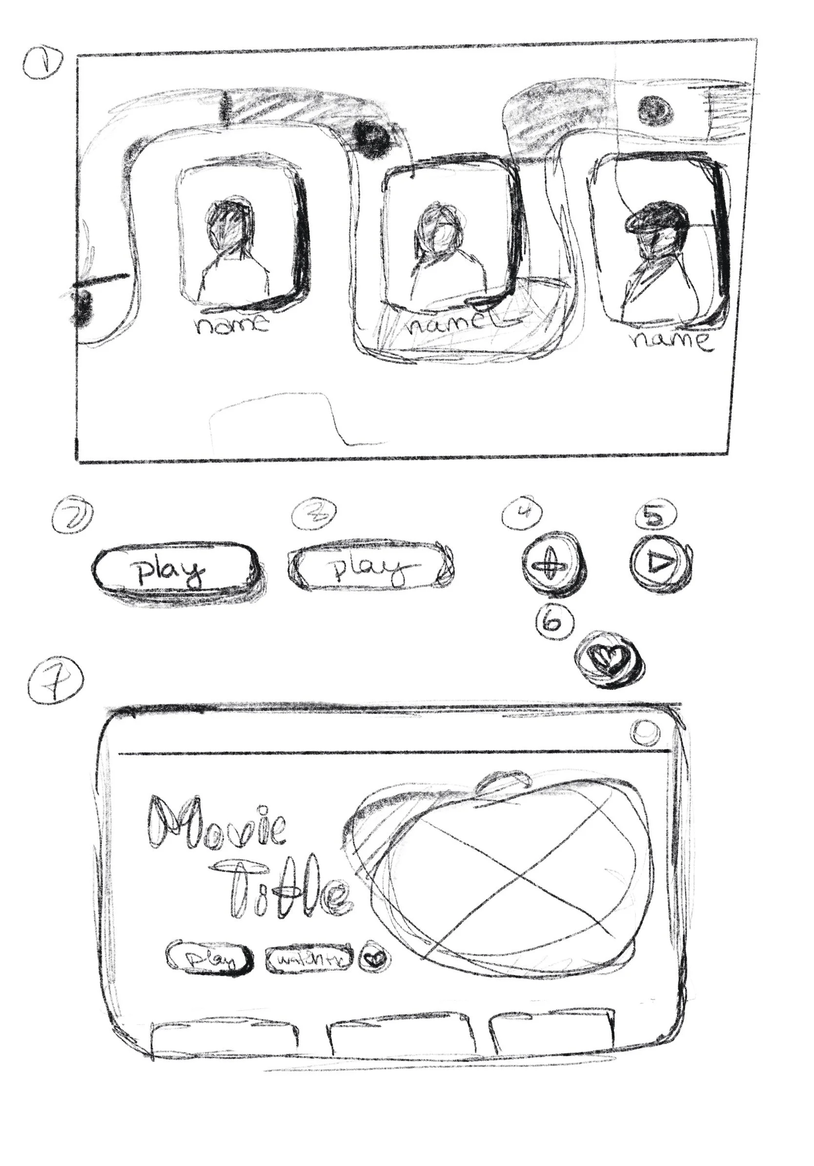
As always, I started with rough sketches of layout ideas. Since I am working off an existing brand guide, I already have a look for the site, I just need to figure out how and in what way to arrange my components.
Wireframing
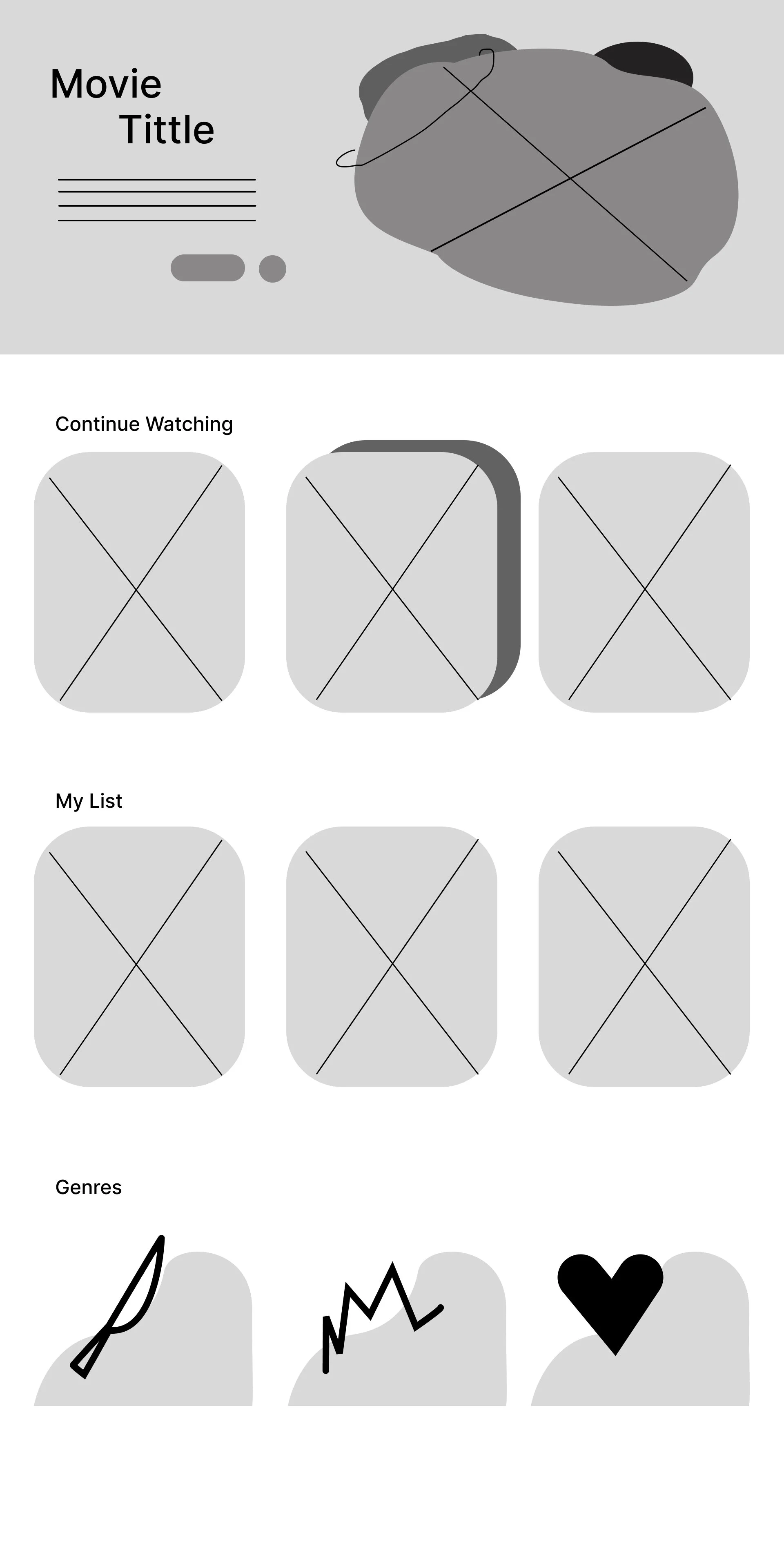
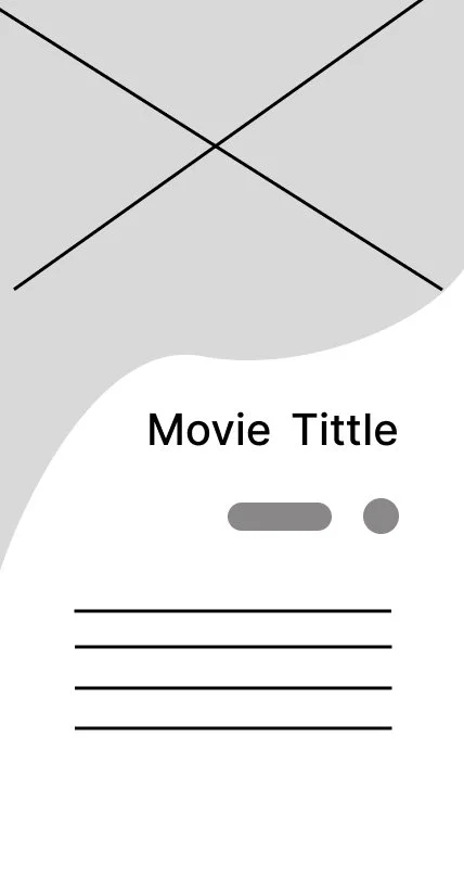
After some critique and helpful feedback from peers, I began working on Wireframes. I decided what were the most important aspects of a streaming service that I should have from the get-go: A profile selection screen, a main page, and an example of a selection-specific screen.
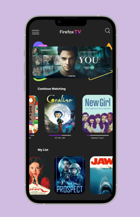
I included what I thought consumers would find helpful such as a genre section, a continue watching section, and a “my list” section. All of these are things we’ve seen before, so while they’re not a creative new thing, they’re all user-friendly and intuitive.
I continued to keep Firefox’s style in mind. Some specific style options reflected their brand such as rounded corners and fun shapes.
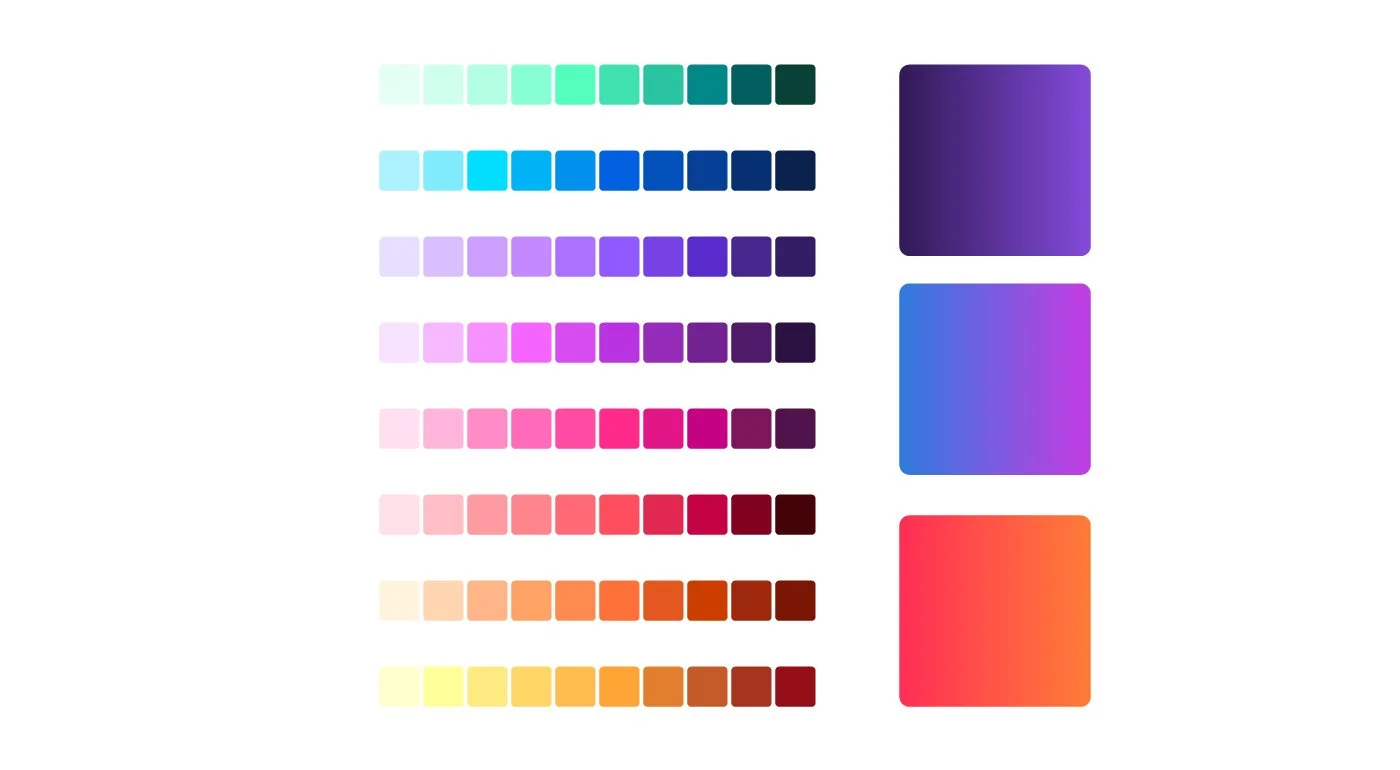
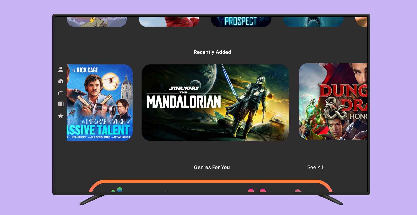
Moving forward with wireframing, for both TV and mobile, I continued to add design elements that I believe reflect the brand’s style. I placed different shapes throughout the site to emphasize originality. For colors, I kept it dark with pops of color and gradients.
I continued to find ways of staying within what a consumer expects, but I found ways to be creative and make this stand apart. I made custom icons for the genre section utilizing Firefox’s brand colors and tried to carry that across the whole site.
High-fidelity
Wireframing
After knowing I had my basic building blocks, I went ahead and put almost everything into my wireframe: Colors, shapes, images, and text.
For the user profile page, I used animal icons. I figured it would be a fun customizable feature that both went with the brand (Firefox has a fox) and kept that lively look.
As for the main home page, I wanted to keep all those elements that are user-friendly and expected. I included sections that were personalized and sections that gave the brand the opportunity to plug in new releases, and just general media they would like to showcase.
I realized that small elements matter! things such as search bards, descriptions, scrolling features, and buttons are all extremely important for this streaming service.
Finals
TV
Mobile
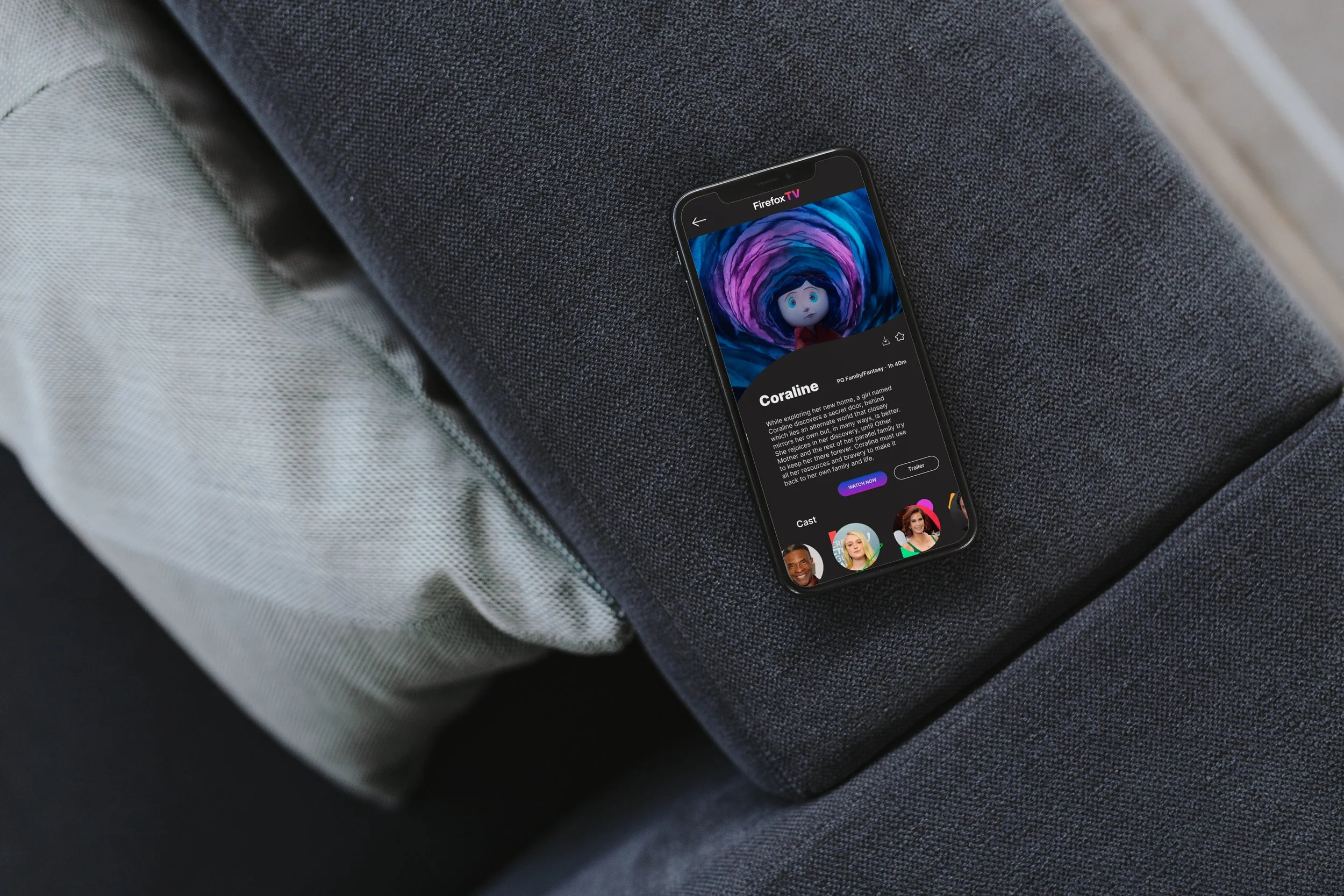
With my finalized wireframes I reflect on my goal and if I achieved said goal. Does this align with Firefox’s style? Yes! I’m very happy with how this streaming service came out. I believe it looks fun and lively while also keeping itself user-friendly.
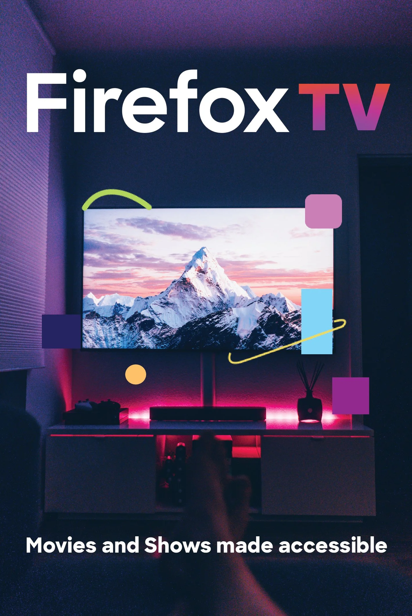
I decided to use these wireframes for mockups and to create promotional material. I wanted to explore what else I could create while using the style guides.
