The Art of Stop Motion Animation
The Art of Stop Motion Animation
Booklet:
The Art of Stop Motion Animation
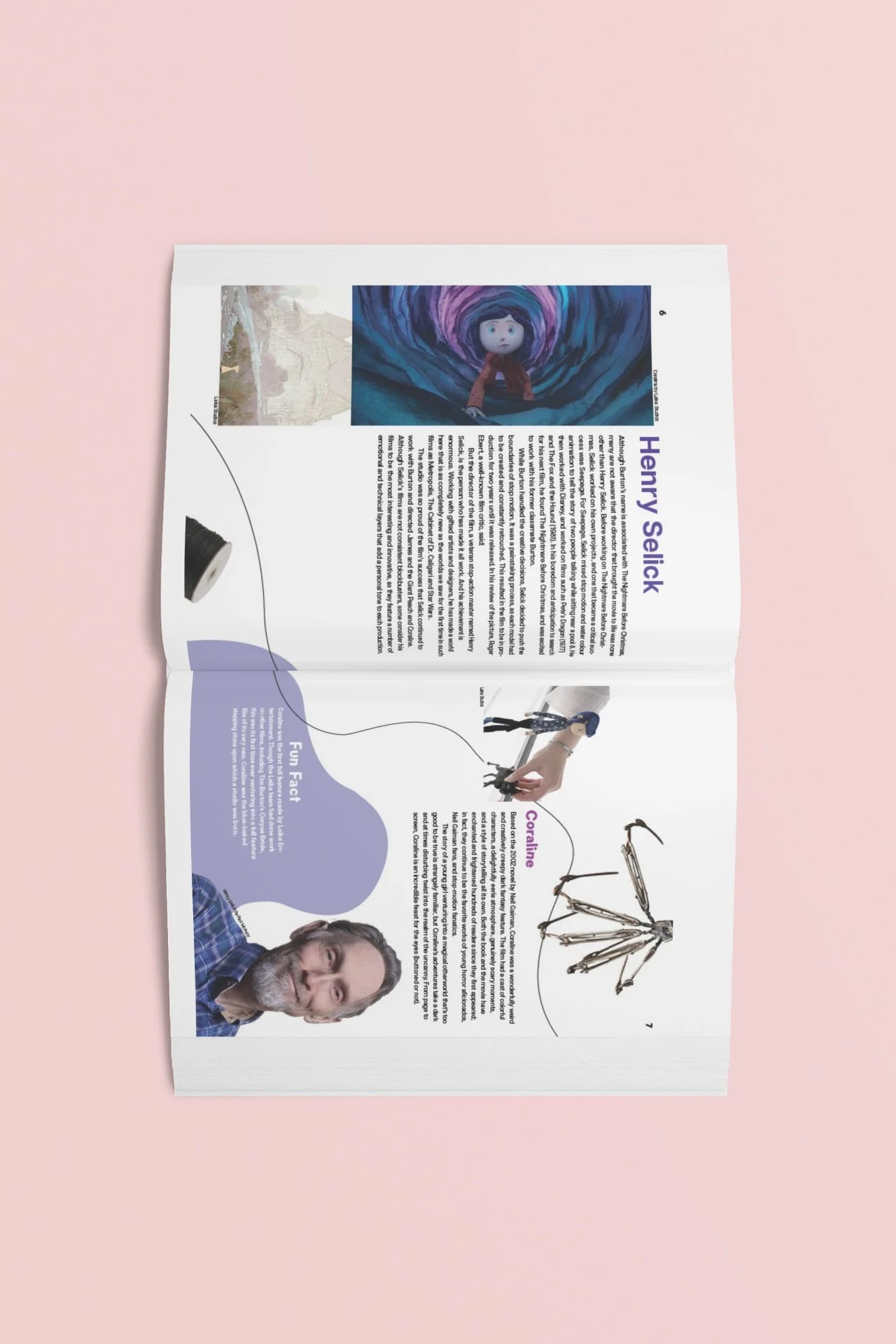
I created a a booklet to showcase one of my favorite forms of media, stop motion animation.
Goal
My goal with this project was to create a booklet with an effective layout and flow. I wanted to showcase how stop motion came to be and who are some of the popular stop motion creatives.
Initial Stage
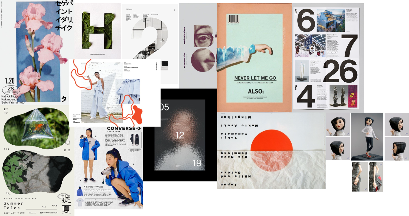
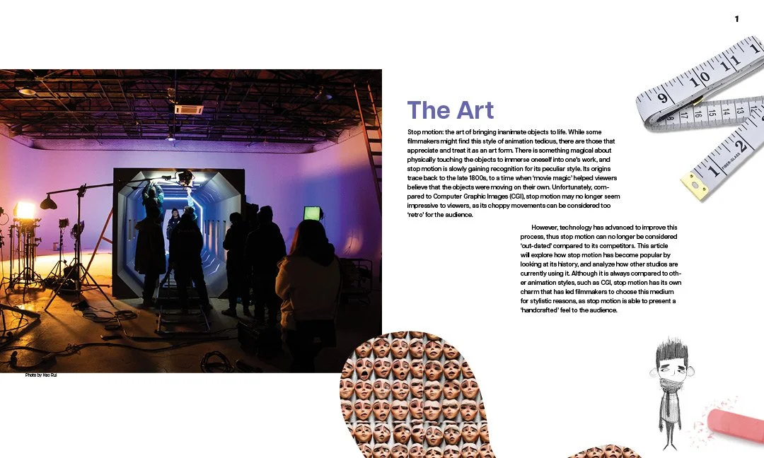
My first step for this booklet was inspiration. With my mood boards, I can get a feeling of what general direction I want to move in. In this case, I wanted to go for a clean look with a lot of white space. I also wanted to use organic shapes and pops of color.
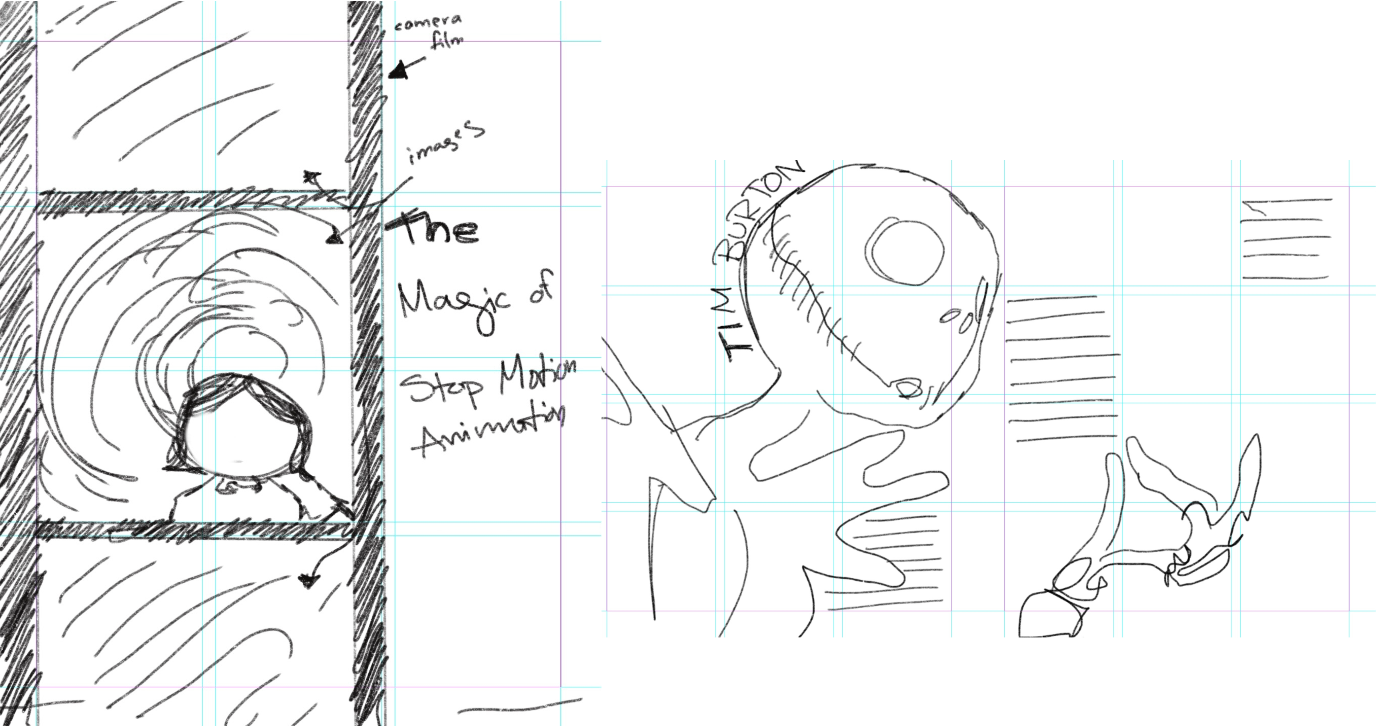
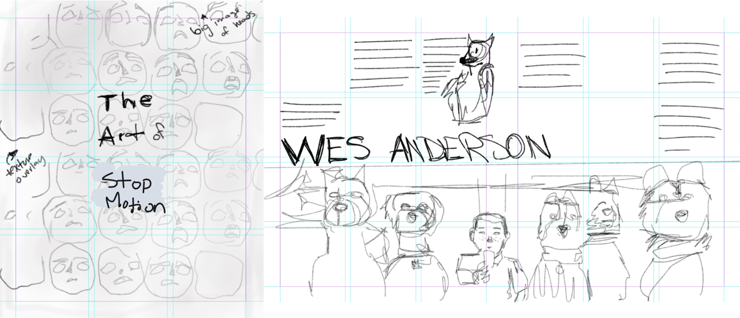
With my inspiration down, I made initial sketches for layouts. I knew I wanted to play with having images interact with the body copy. I wanted to have an overall playful feel.
Content Map
A very important step I took was creating a content map. This was my blueprint for my entire booklet. This not only gave me a guide on the order of my material but also helped me see how to farm this booklet in my design program. Since a booklet involves spreads, I had to make sure my amount of pages would work for print
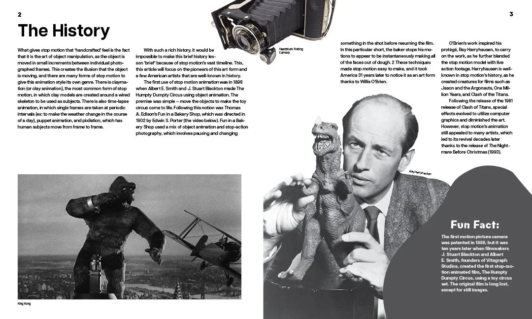
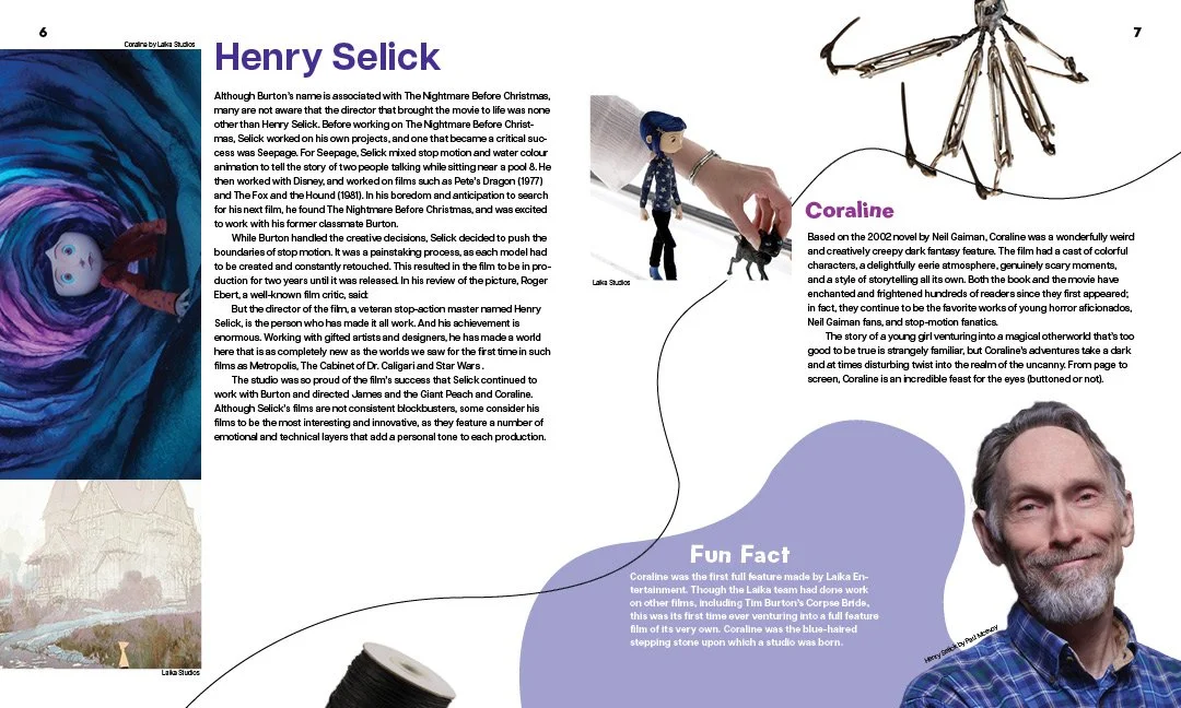
I decided that I wanted to give some context to what stop motion is, the history behind it, some known artists, and the future of sop motion.
This could always change, and it did. However its important to have a base when it comes to designing.
Digital Drafts
Round One
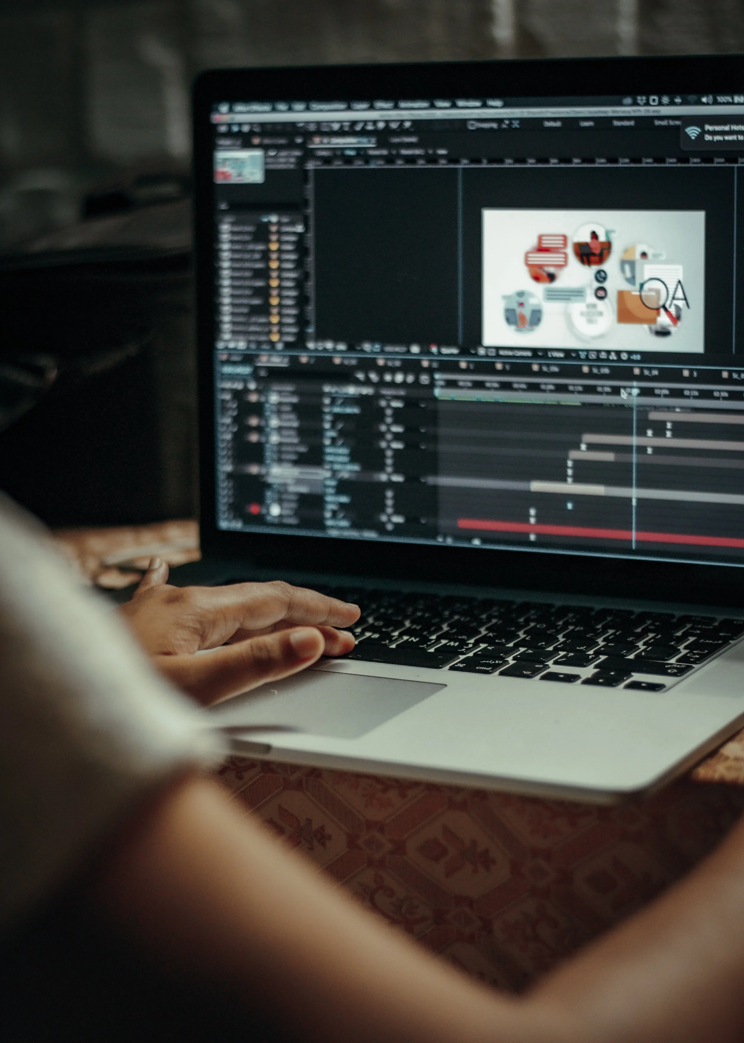
For my first round of digital drafts I started with just two pages of the booklet. I was still getting a feel of the overall look and flow I wanted throughout the booklet.
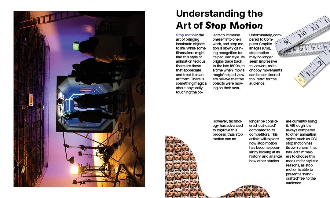
I used a lot of white space as a way of making it 1) easily readable and 2) give the pictures breathing room and a chance to stand out. I also played with text wrap around my pictures.
Round Two
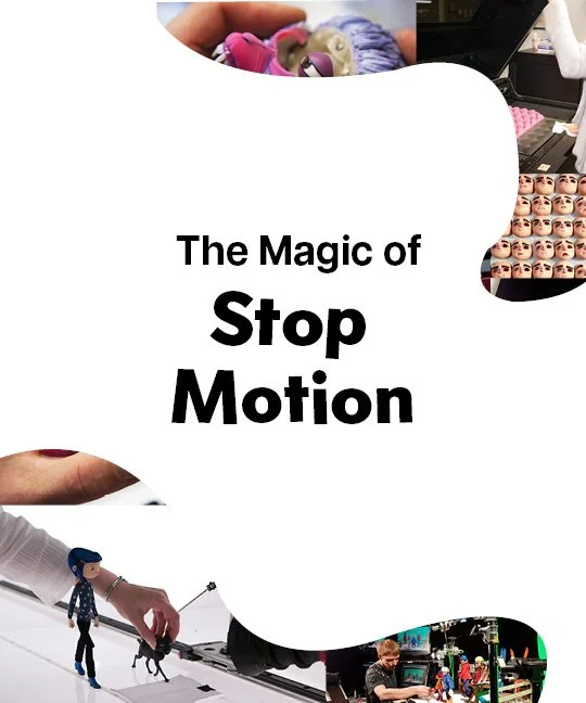
For my second draft, I began exploring the use of organic shapes and having the images be in the shapes. I liked this because it brought a playful feel to the layout and was a way for be to manipulate the visual flow of the page.
Round Three
By round three, I had started to add more pages to my layout. The overall look remained the same: lots of white space. text wrap around certain images and organic shapes.
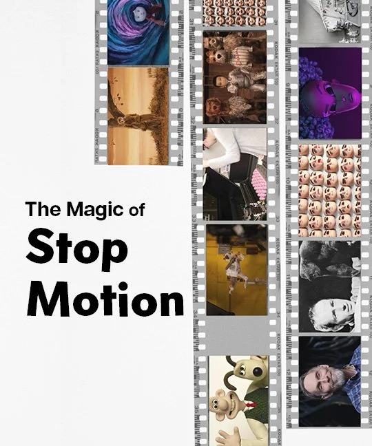
The cover of the booklet for this draft was a combination of both draft 1 & 2. I also made the images in the film be stop motion images I had sourced.
Round Four
By round 4, I had all my pages fr my layout, and I had a very good base. From this point forward all I had to do were minor changes and tweaks. So what did I evaluate? spacing, flow and balance
I noted that I had to make sure all spaces in between paragraphs were all equal for consistency and image cutouts helped the flow of text and guided the viewers eyes throughout the layout.
Final Layout
For the final layout, I took all the critiques and my personal knowledge into consideration. I am very happy with how this booklet turned out. Its informational, while also being playful and contains visual elements related to the topic.
This project was not only a real test of my abilities when it came to typography but also a test of the visual principles I’ve learned. Creating a booklet was not just putting words on paper; it took a lot of consideration over visual design principles. I had to remember to be mindful of spacing, leading, flow, and balance.
This project helped me apply visual principles and taught me new skills when it comes to typography.
Previous Project:
Simply Fresh
Next Project:
