Blue Bay Aquarium
Blue Bay Aquarium
Branding:
Blue Bay Aquarium
For this project, I create a brand and a brand book for said brand. I chose to create branding for an aquarium. It was up to me to bring this brand to life.
Mood Boards
Sketches and Ideation
To kick off this project I started at square one: the idea.
After deciding to do an Aquarium, I had to decide how I wanted the brand to look, and most importantly who this was for.
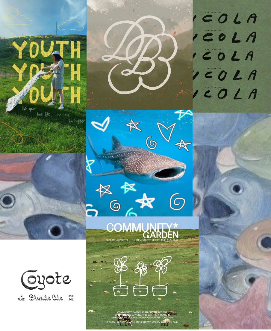
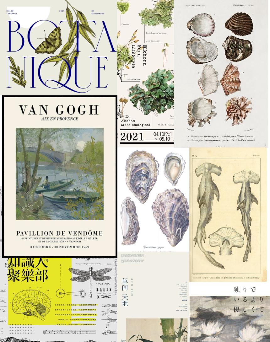
I wanted this aquarium to be informative and mature. While there’s nothing wrong with it, my goal is to stray away from the childish look many aquariums have. With that I made my mood boards I would use as inspiration going forward.
This aquarium is an informative and mature space for anyone interested in learning about marine life.
Initial sketches for the brand weren’t necessarily what I planned on using for a logo, but they helped my design process. Visualizing what one would expect when you think aquarium.
At this point, I had two solid ideas for the name: Wonderous Bay and Blue Bay. I tried exploring both possibilities, but after some thinking, I figured Wonderous Bay leaned too into the child-like brand look I am straying away from, so Blue Bay was my choice.
Digital Drafts
Round One
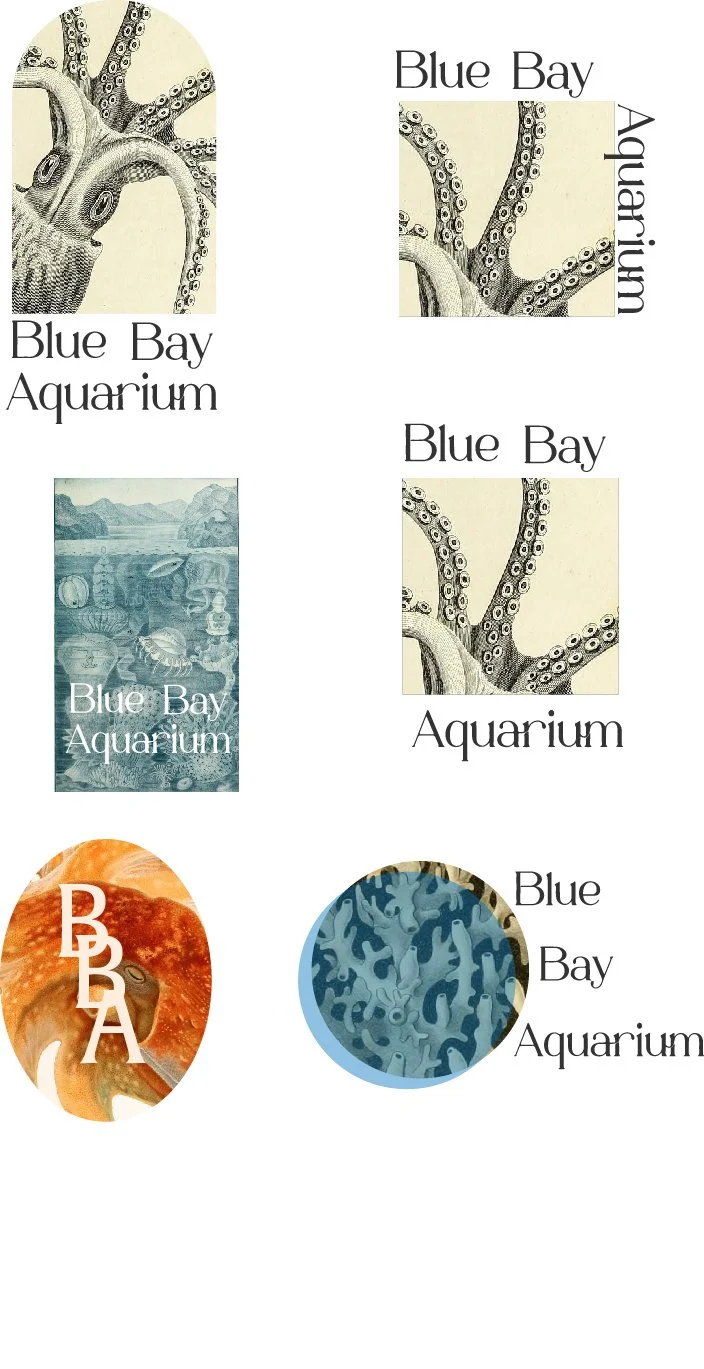
For the first digital drafts, I explored a few different concepts and ideas. I used the idea of scientific illustrations I had pulled from my mood board, while also exploring bold colors.
While these ideas received a good reaction from my peers, I ultimately got the sense that these were reading more as illustrations than strong logos. At this time I decided to regroup and give more thought about what would make a strong logo.
Round Two
Seconds digital drafts felt much stronger. After a good critique with constructive feedback, it was clear that the word mark Blue Bay with the custom tentacle adornments was a favorite. A strong wordmark like this has so many possibilities for variations and overall brand marketing
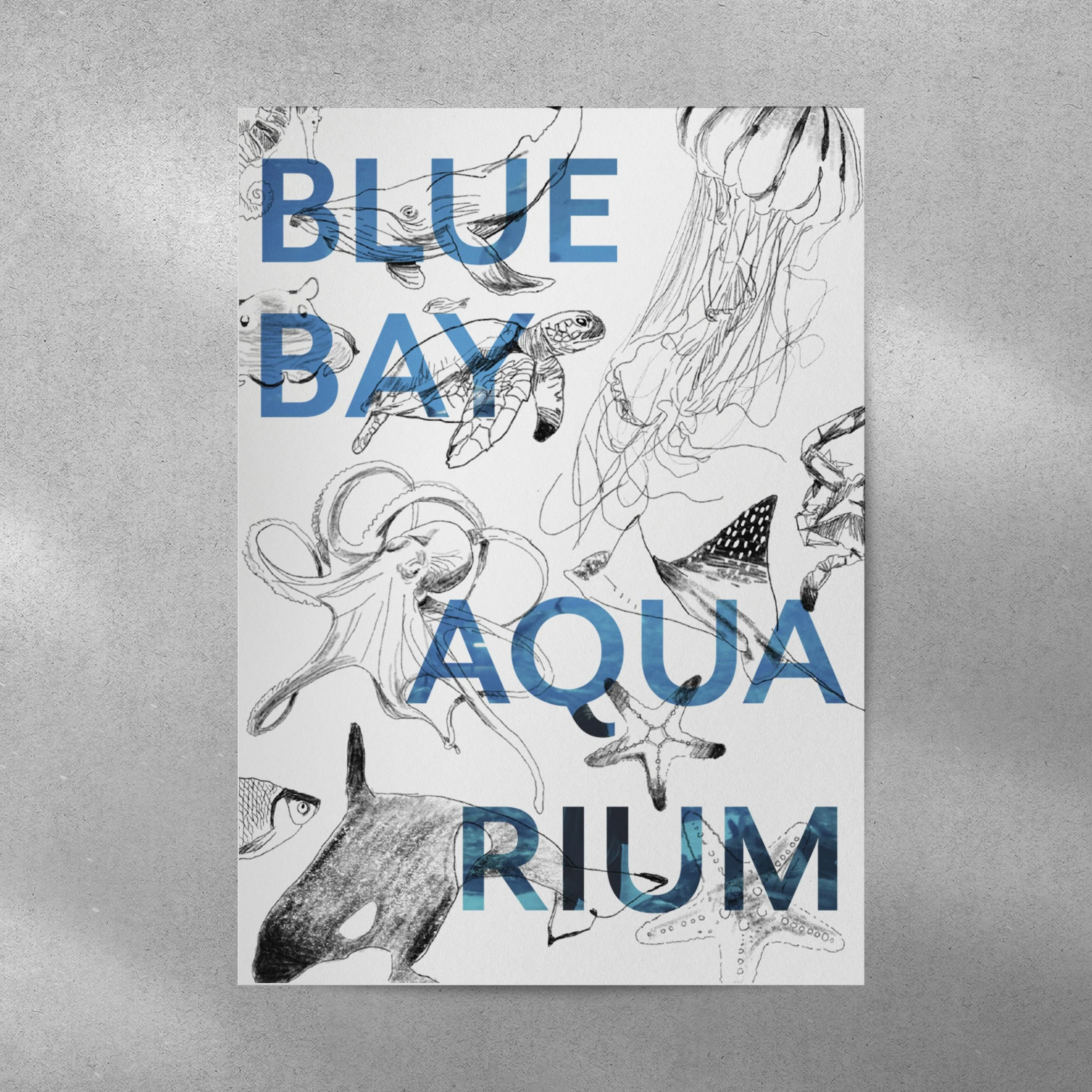
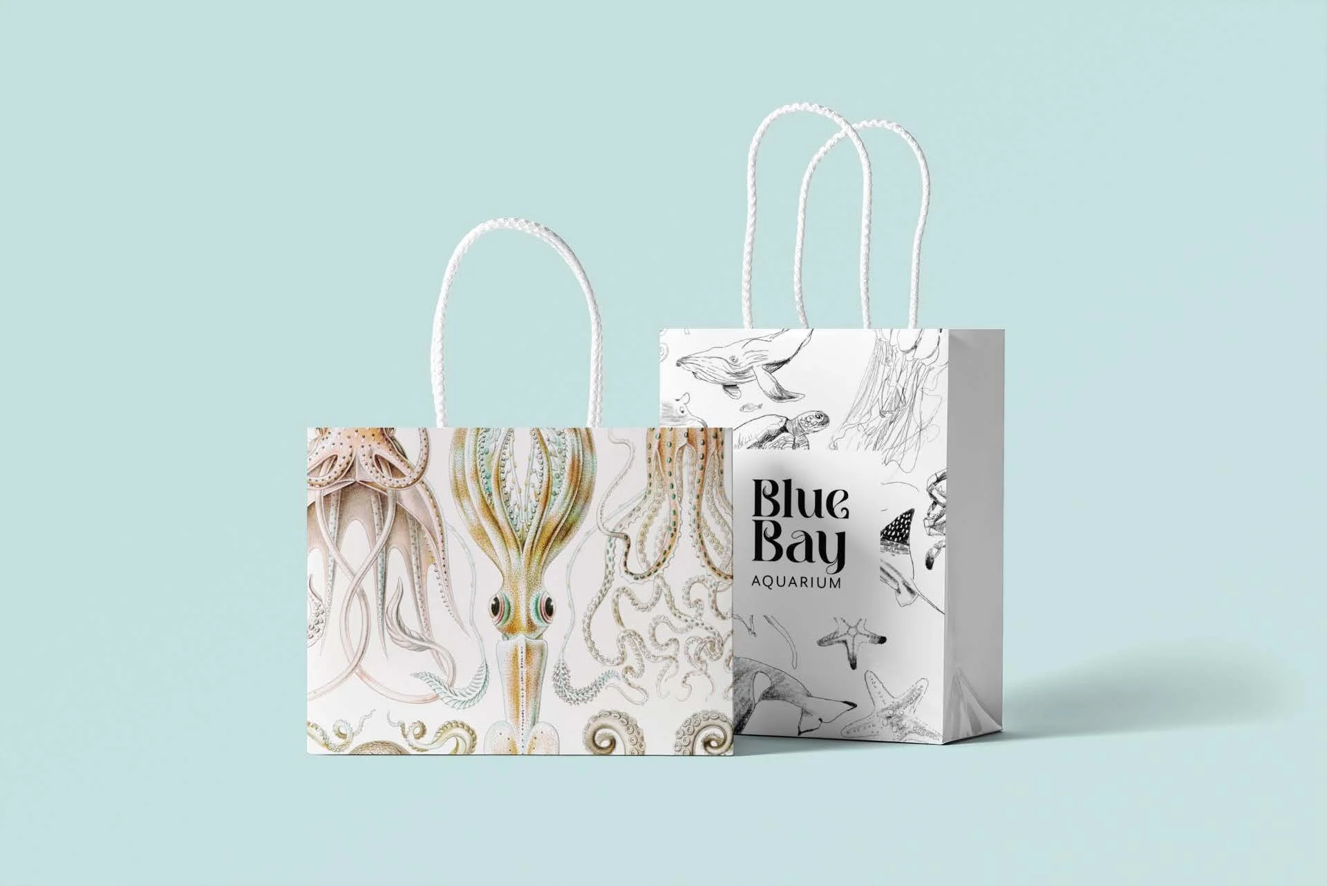
I also noticed I received good reactions to my hand-drawn sea creatures. I felt that having my drawings could make this branding unique, so I wanted to explore how to incorporate those.
Finalized Logo
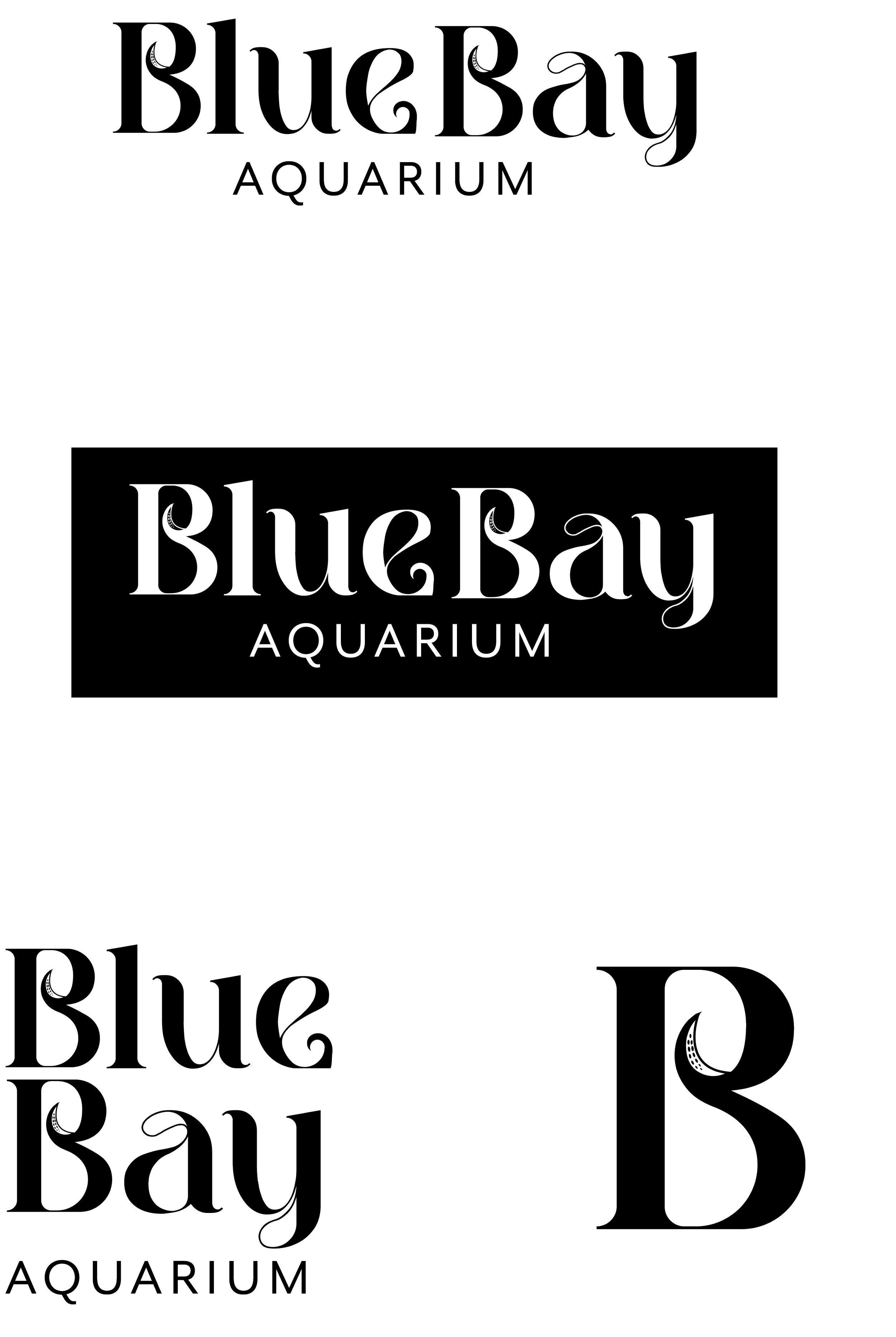
The final logo and logo variations are simple yet strong. I made these with the idea of not just making a logo, but also creating branding. This logo has a hint of uniqueness with the customized tentacle on the letters, while also looking clean. It feels like a mature look and I believe achieves the look I wanted at the beginning of this project. With a strong base, branding would be very easy to play with.
Branded Material
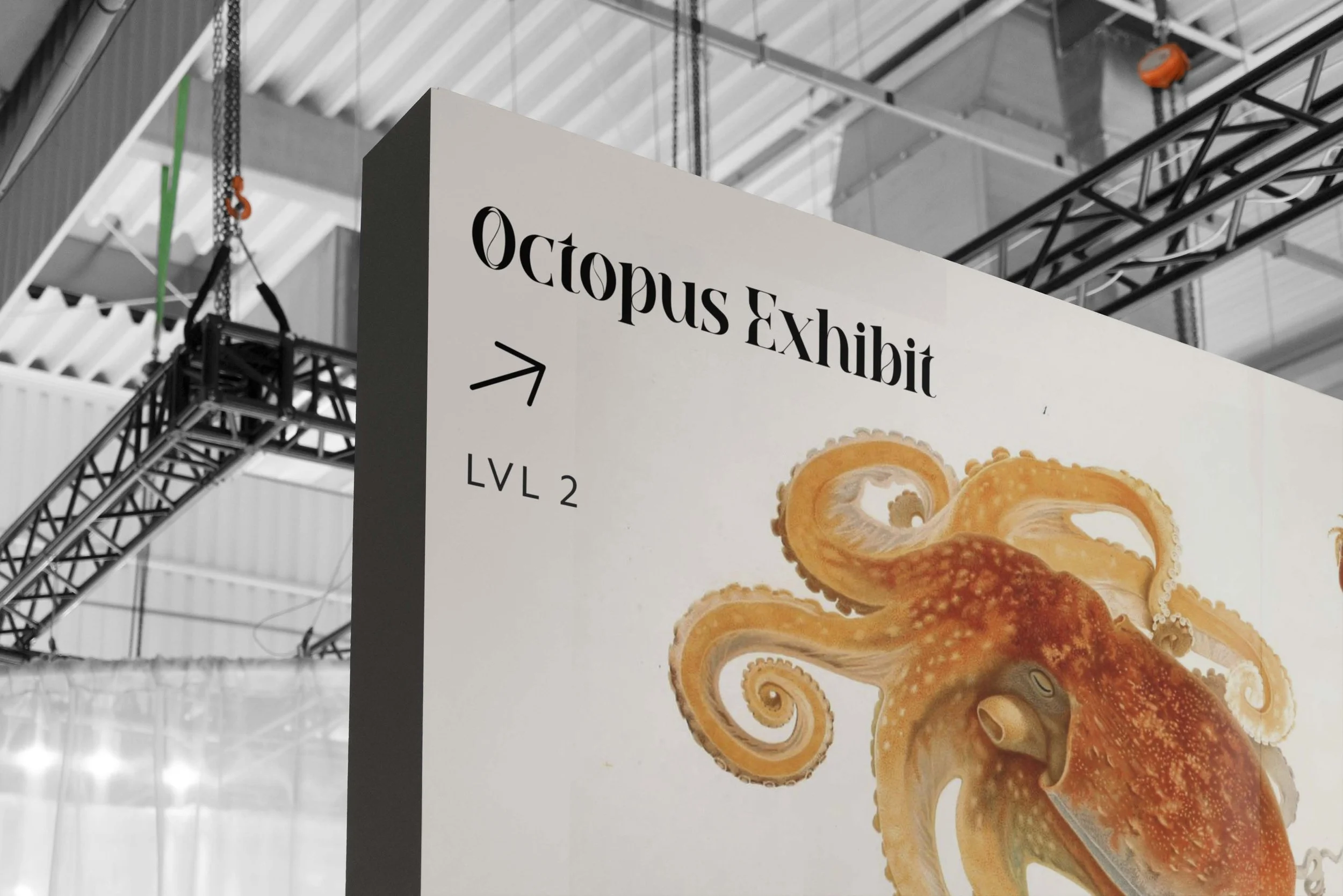
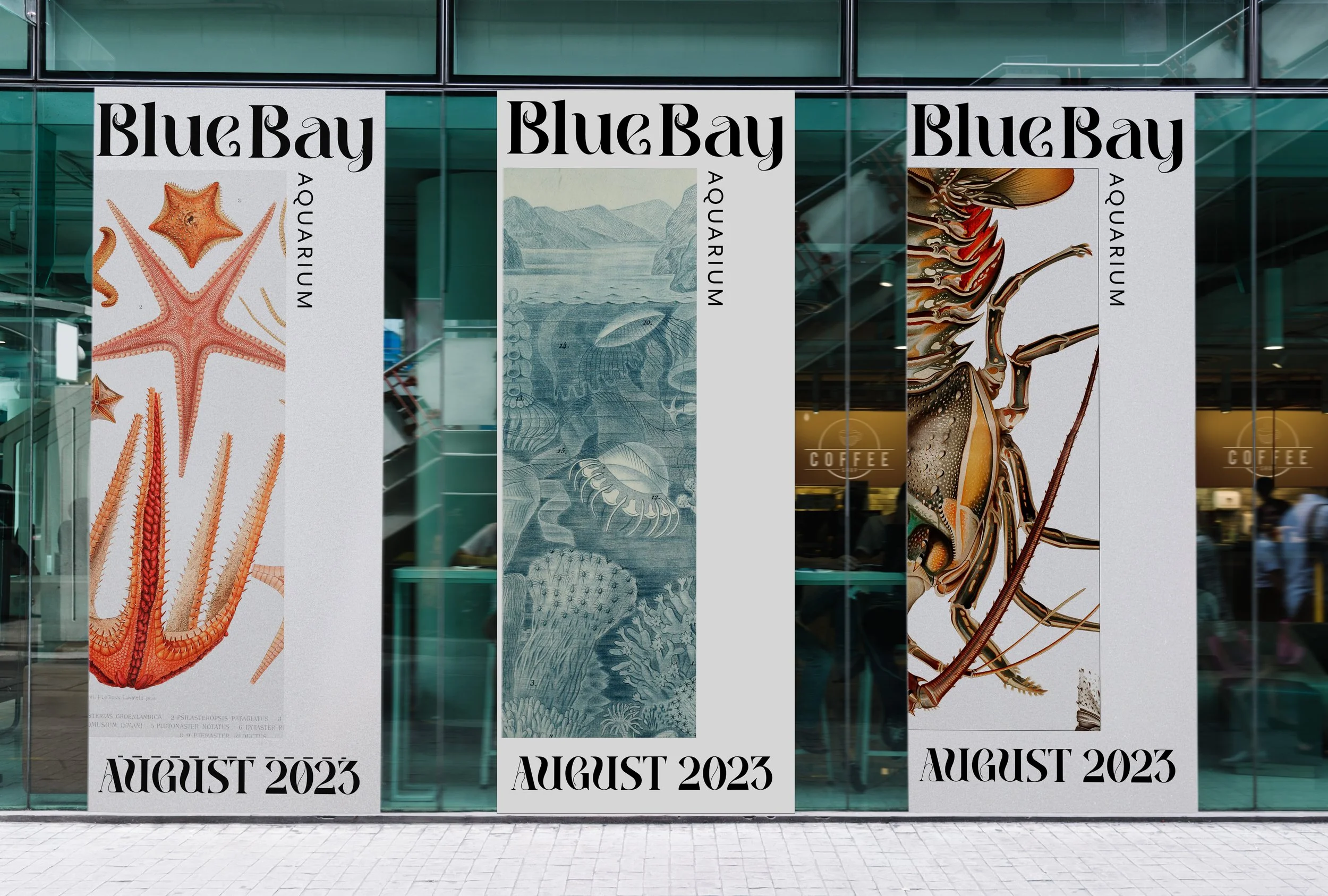
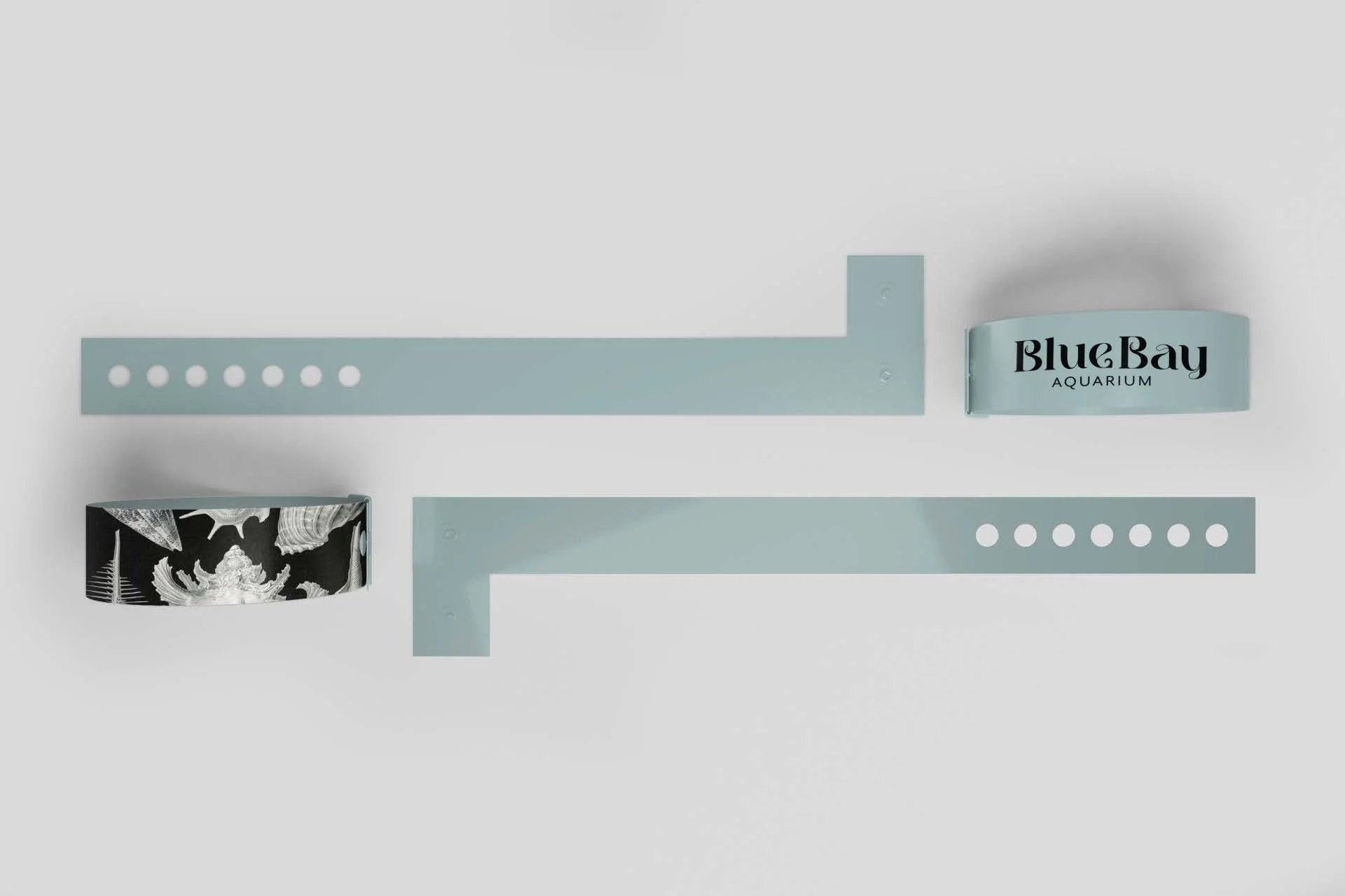
With my finalized logo, it was time for branding. I took my logo and applied it to things I believe make sense, while also getting to add elements such as colors, illustrations, and my hand draws illustrations. This really brought everything together and I’m extremely with how this project came out.
Next Project:
