Muley's Milk
Muley's Milk
Package Design
Mulley’s Milk & Dairy Products
I was tasked to design packaging for any product that comes in a bottle or can. I chose milk!
Objective
The objective of this project was to create a high-end bottled product. After choosing what product to design, I then had to determine who my audience was and what makes this specific brand unique. I chose to create packaging for a milk brand
The main audience is adults looking for a sweet, but healthy drink. Considering most flavored milk is catered to children, Muley’s is meant to break from that and be unique.
Mood Board
From the start, I chose to go for a Western-inspired concept. It not only had the potential to be fun but also unique. I also had not done any Western-inspired designs up to this point, so it felt like a chance to explore a new style.
I searched and found Western-inspired illustrations with a modern twist. I leaned towards light colors that you could associate with flavored milk.
Sketches
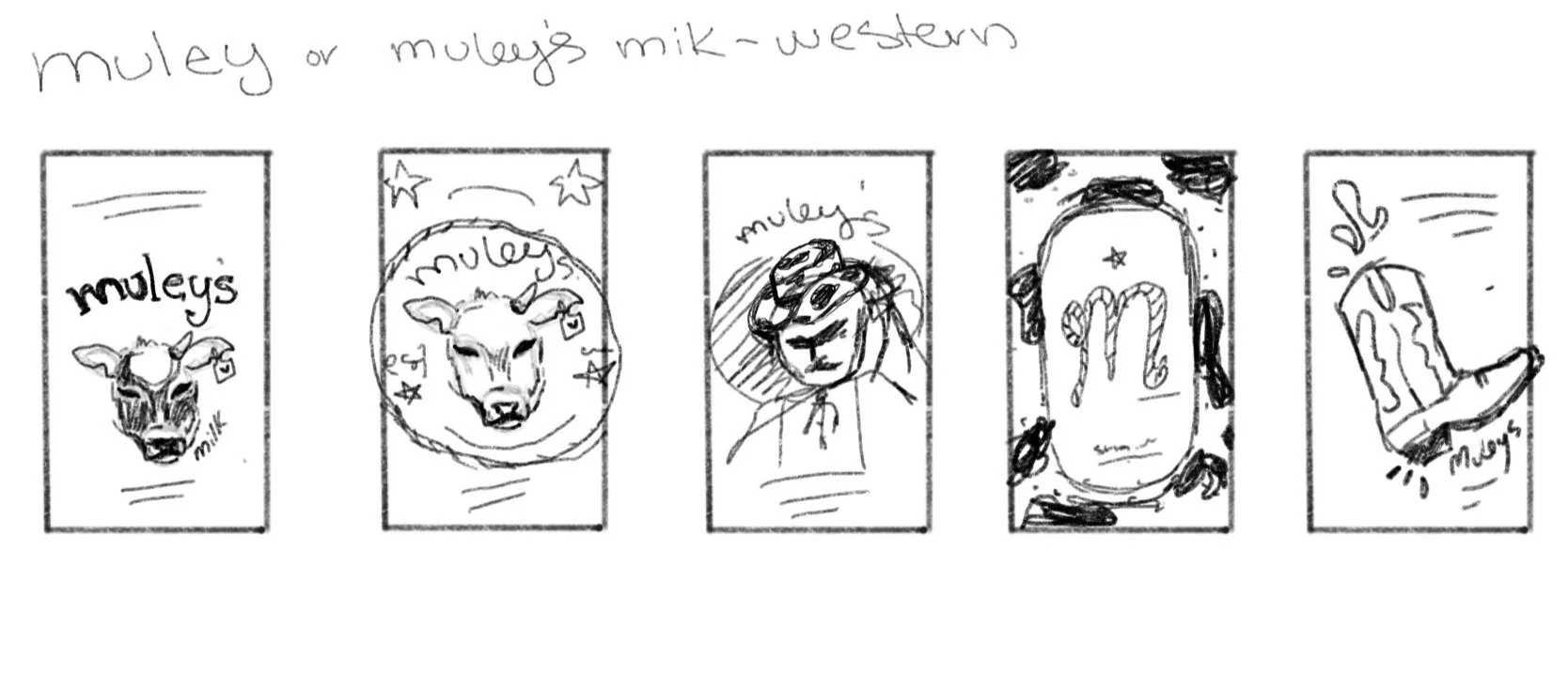
At the beginning of my sketching process, I had to choose my brand name. I chose Muley’s: a one-horned or hornless cow. I chose this because it was both a Western slang term and also symbolized uniqueness which I wanted with this brand.
For sketches tried using a few different concepts playing with type-focused, illustration-focused, and a combination of both
Digital Drafts
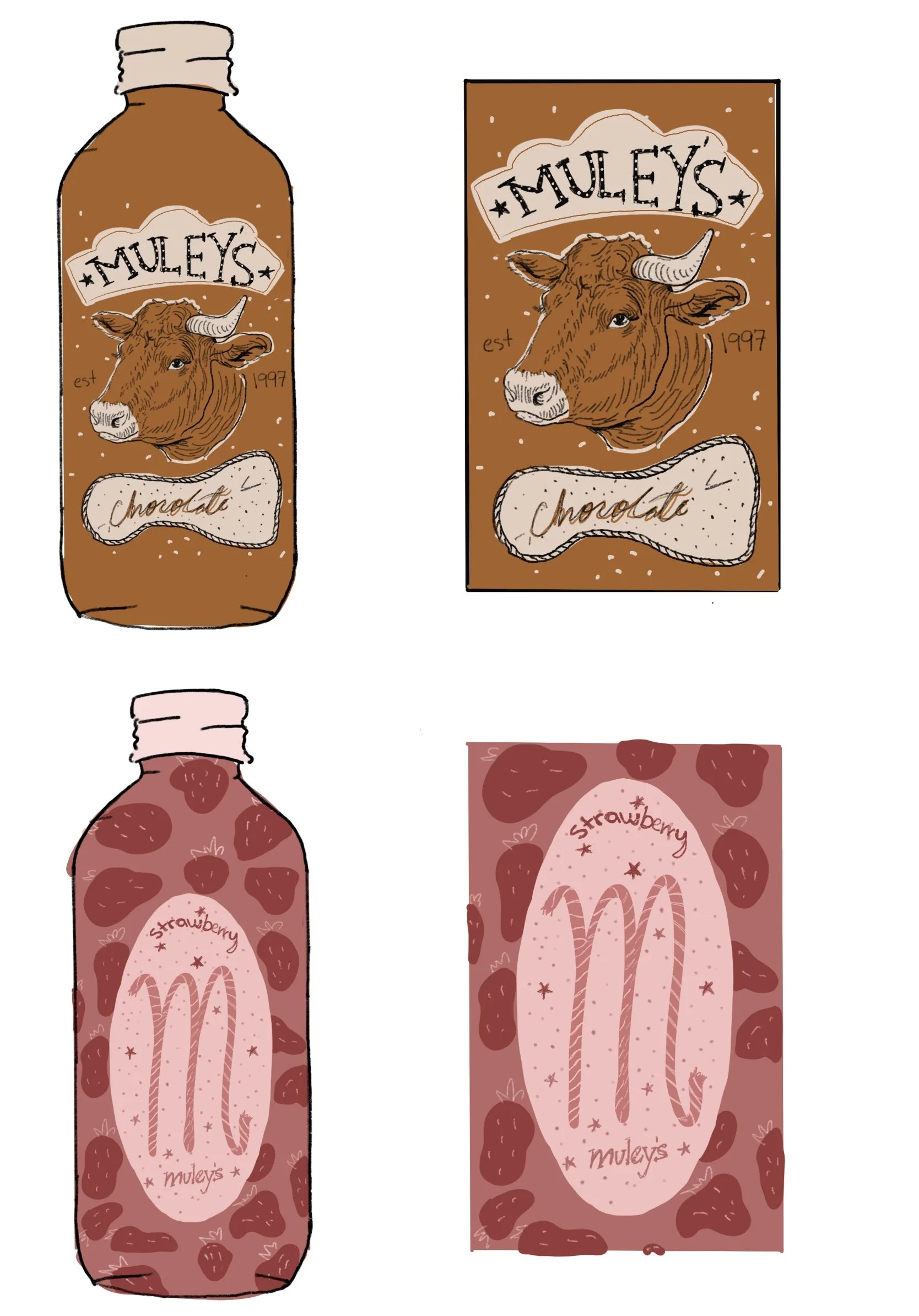
I produced two digital sketches that were reviewed and critiqued by my peers. The illustration of the one-horned cow seemed to have the most positive response. I believe having a strong image that can be tied to a brand is favorable.
I planned on taking some elements from both options and merging them into one design.
Round One
The first digital draft definitely felt like a step in the right direction. I combined small elements from both digital sketches such as the cow print and dots from the second option, but also added the cow illustration and rope from the first option.
Round Two
Improvements to be made:
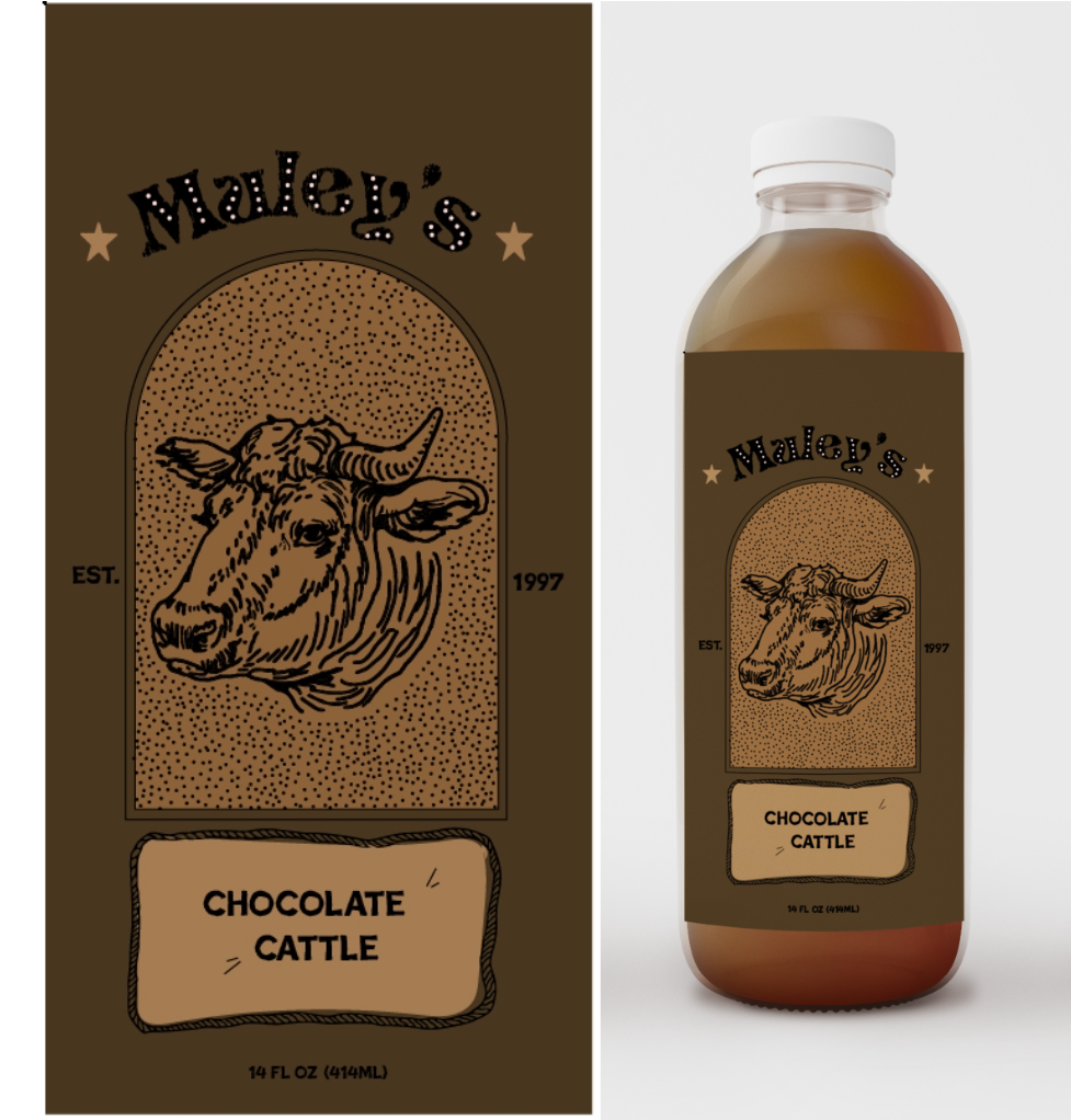
while I liked the design, some aspects needed improvement. After a helpful critique, I realized there was an issue with balance and overall harmony. While I wanted to have a lot of good elements, that doesn’t necessarily mean they’ll all work together. My goal was to create a better hierarchy and flow for the design.
Final Design
The final package design marked all my boxes. It feels unique, has a Western theme, feels harmonious, and has hierarchy.
Muley’s Dairy Products
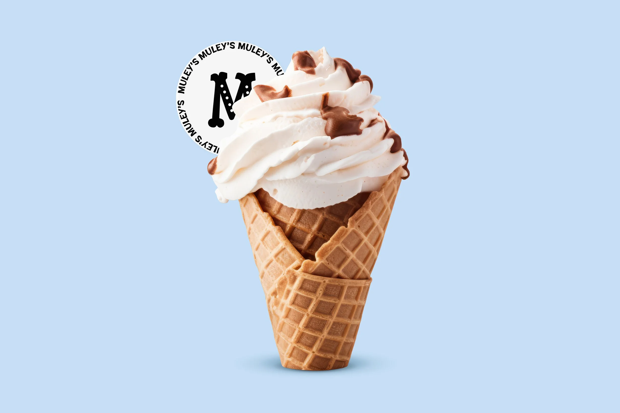
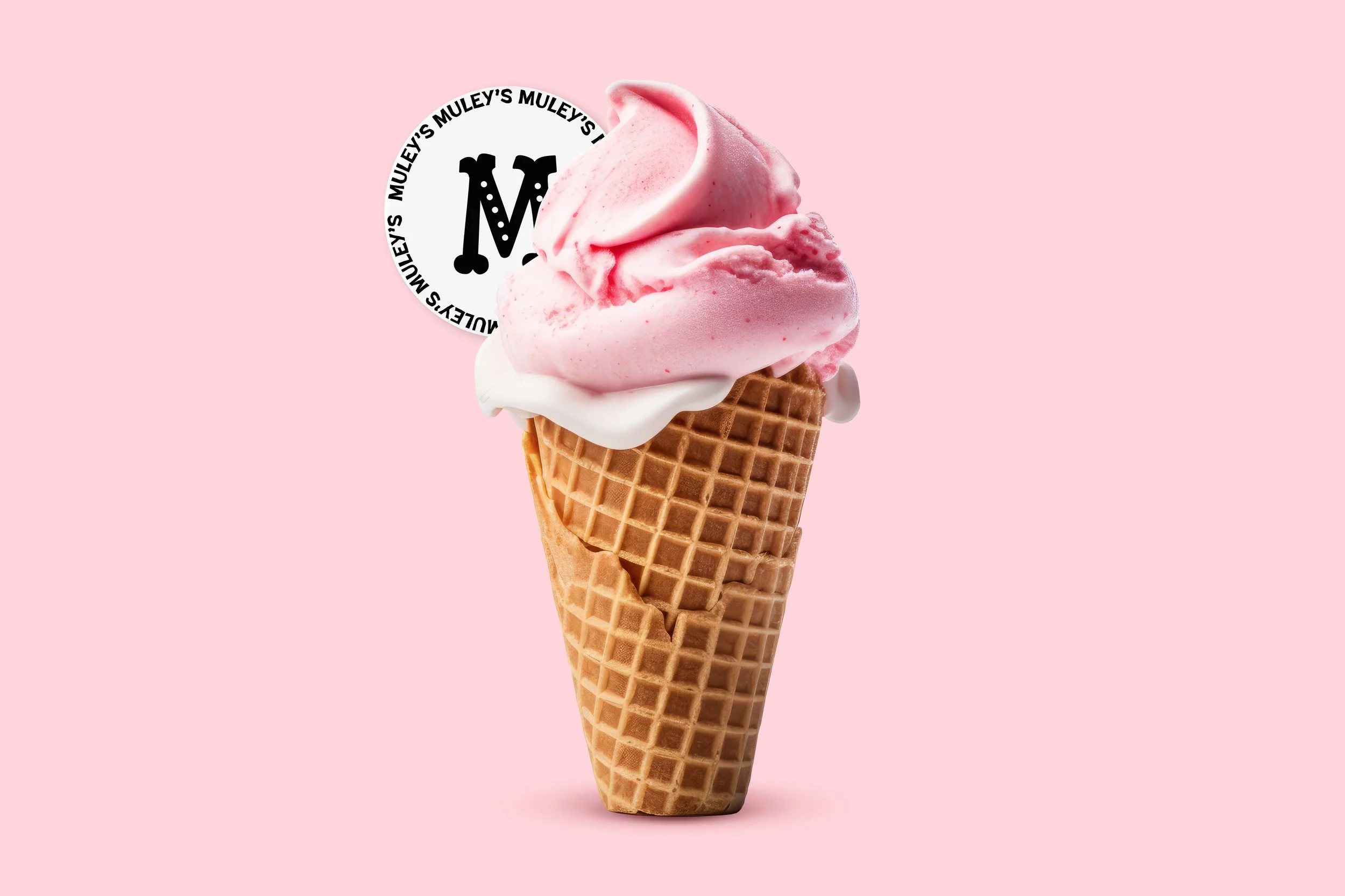
While this is where my project ended, I decided to take this specific brand item and expand. Why stop at Muley’s Milk when it could be Muley’s Dairy Products? With the brand look I created, I explored expanding this brand and created different products such as yogurts and ice creams.
Next Project:
Simply Fresh
Previous Project:
